Main Menu
(click images to view)
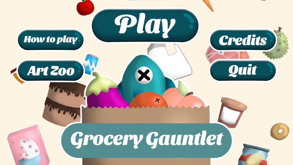
Old Main Menu (before me)

.
This is what we had before I took over designing the menus.
.
.
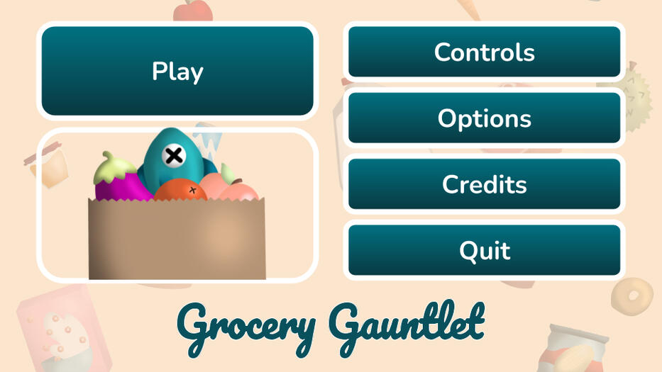
My Old Design (My Wireframe)
My Old Design (In-Game)


.
I redesigned it to make it easier to navigate with a controller. We used my design when we got new art assets.
.
.

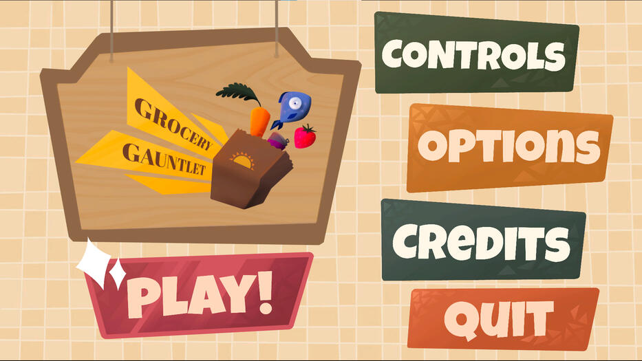
My New Design (Wireframe)
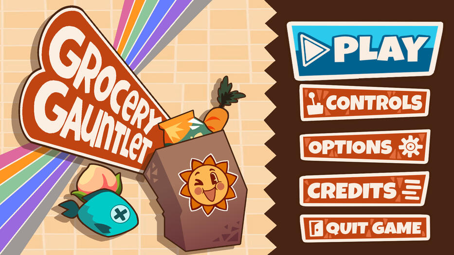
In-Game Menu


.
After the design shift, I changed the menu design to allow room for narrative or tutorial elements. The game logo on the left could be replaced by gameplay clips or animations when idling on this screen.
.
.


